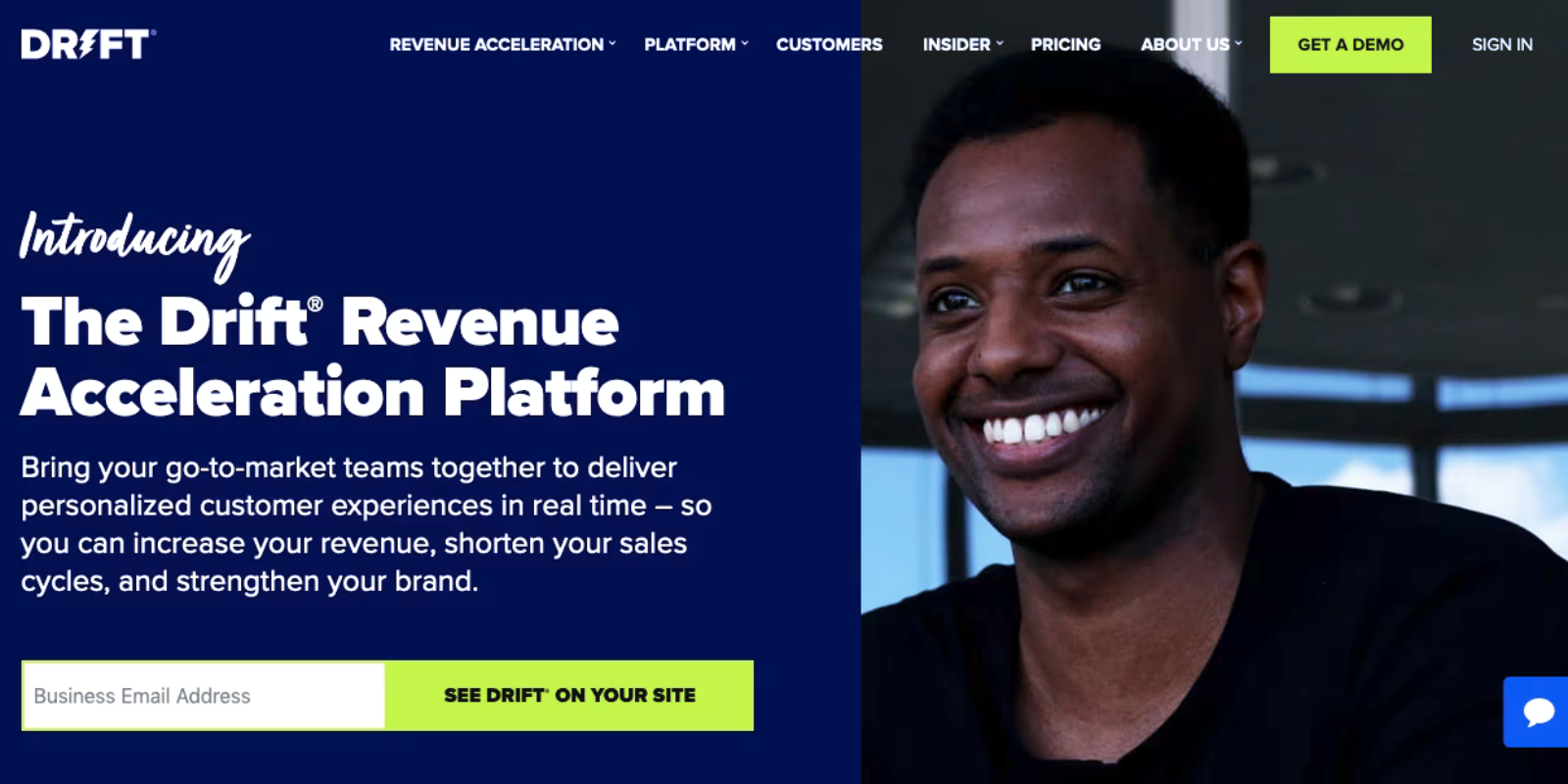
Hero
The
Hero
OBJECTIVE:
In one sentence say who/what we are and why a viewer might engage/buy over an intriguing or engaging photo/video.
Additional
Thoughts
If video, ideally 15-second loop (watch size for delayed loads)
Size limitations? 1200px/1800px
wide
When do we switch from b-roll video to a photo on mobile?
Video must be slient with aspirations
CTA
The
CTA
OBJECTIVE
It must look like an actual button. Words Used. Keep it simple. "How many is too many? (5 max - 2-4 ideal). Utilize both action verbs and urgency.
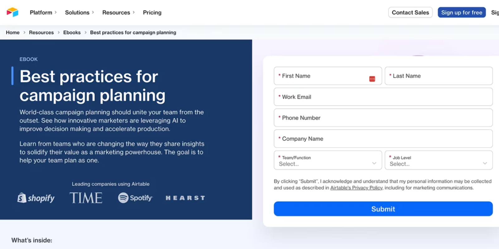
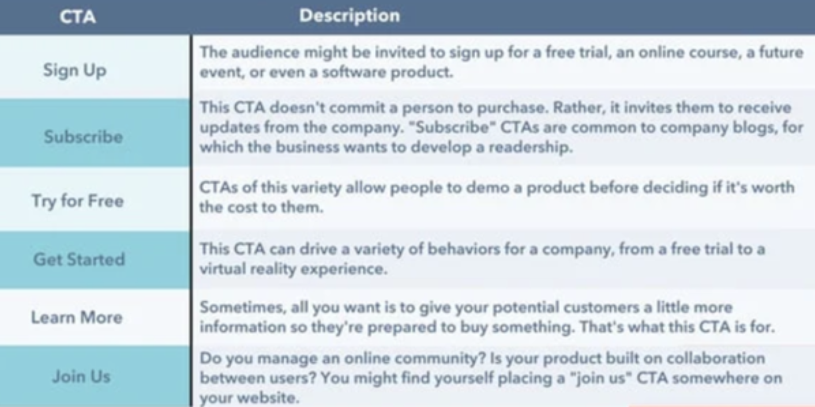
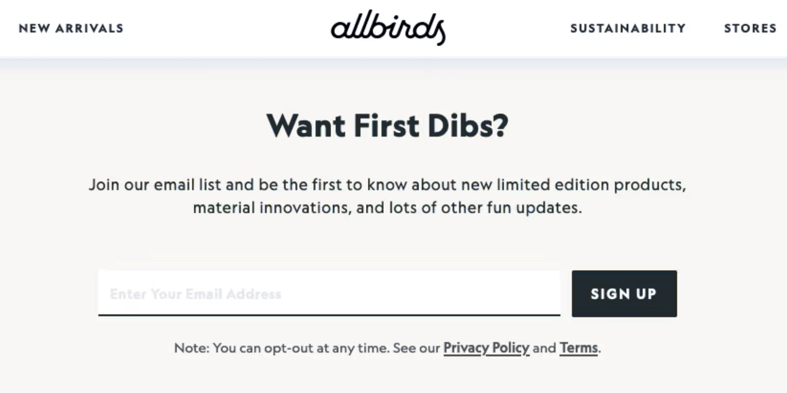
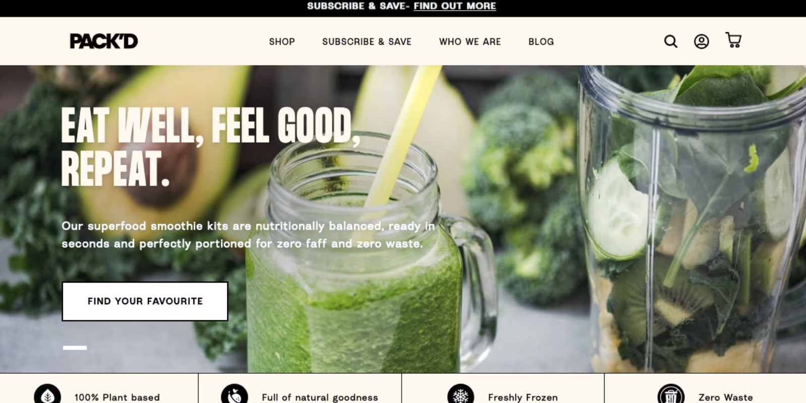
Our
Favorites
I'M IN
TEXT ME
APPLY NOW
GET ON OUR RADAR
BUY NOW
EXPLORE
RESERVE
DOWNLOAD
BOOK A CALL
TALK TO A REP
SHOP NOW
CONTINUE


Our
Favorites
I'M IN
TEXT ME
APPLY NOW
GET ON OUR RADAR
BOOK A CALL
SHOP NOW
BUY NOW
EXPLORE
RESERVE
DOWNLOAD
TALK TO A REP
CONTINUE
Additional
Thoughts
But what color CTA?
Align With Brand, Consistency plz,
But RED is always a winner
Where do CTAs go best?
Form, Typeform, Survey,
Purchase/Product
About
The
About Section
OBJECTIVE:
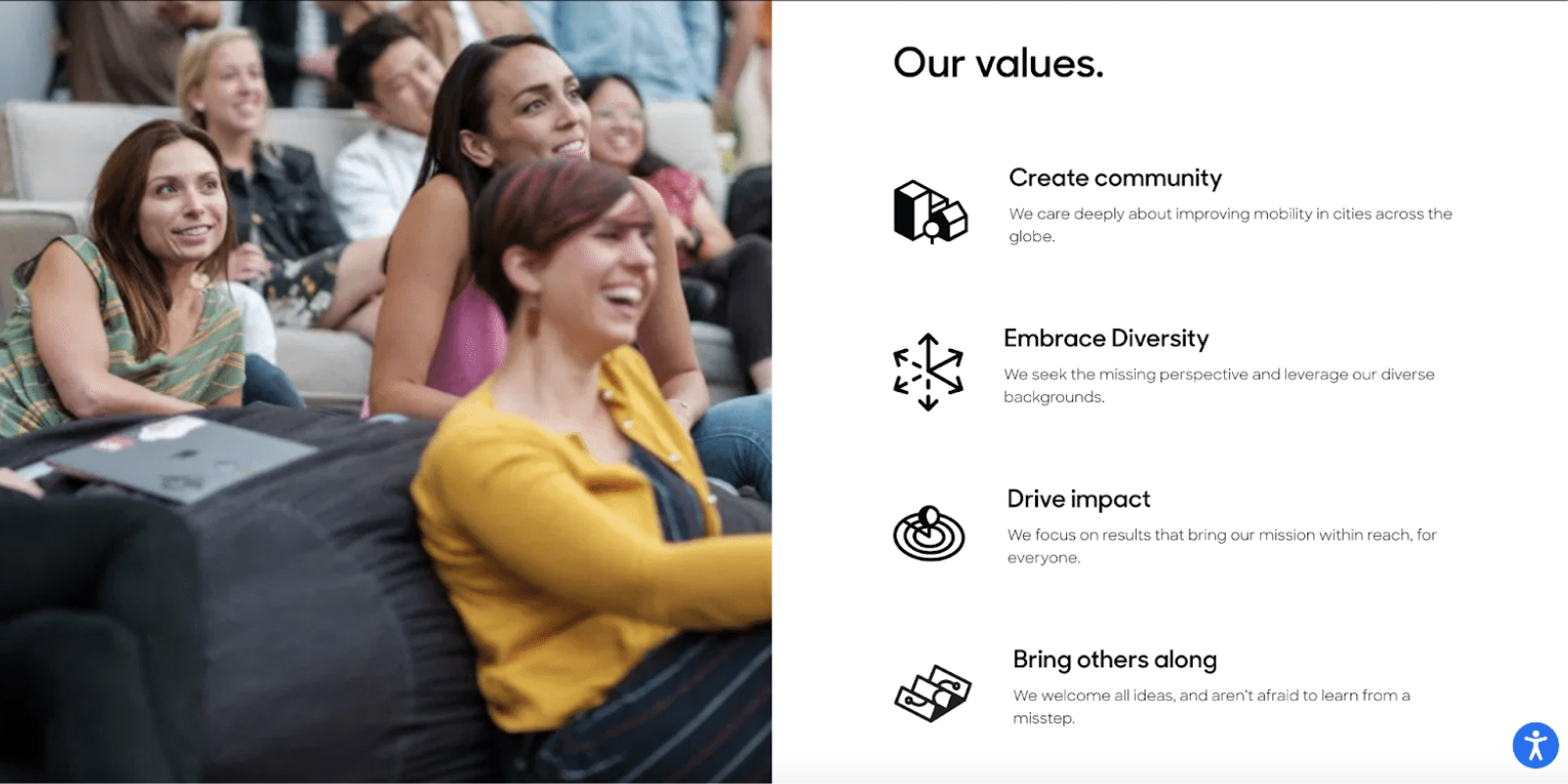
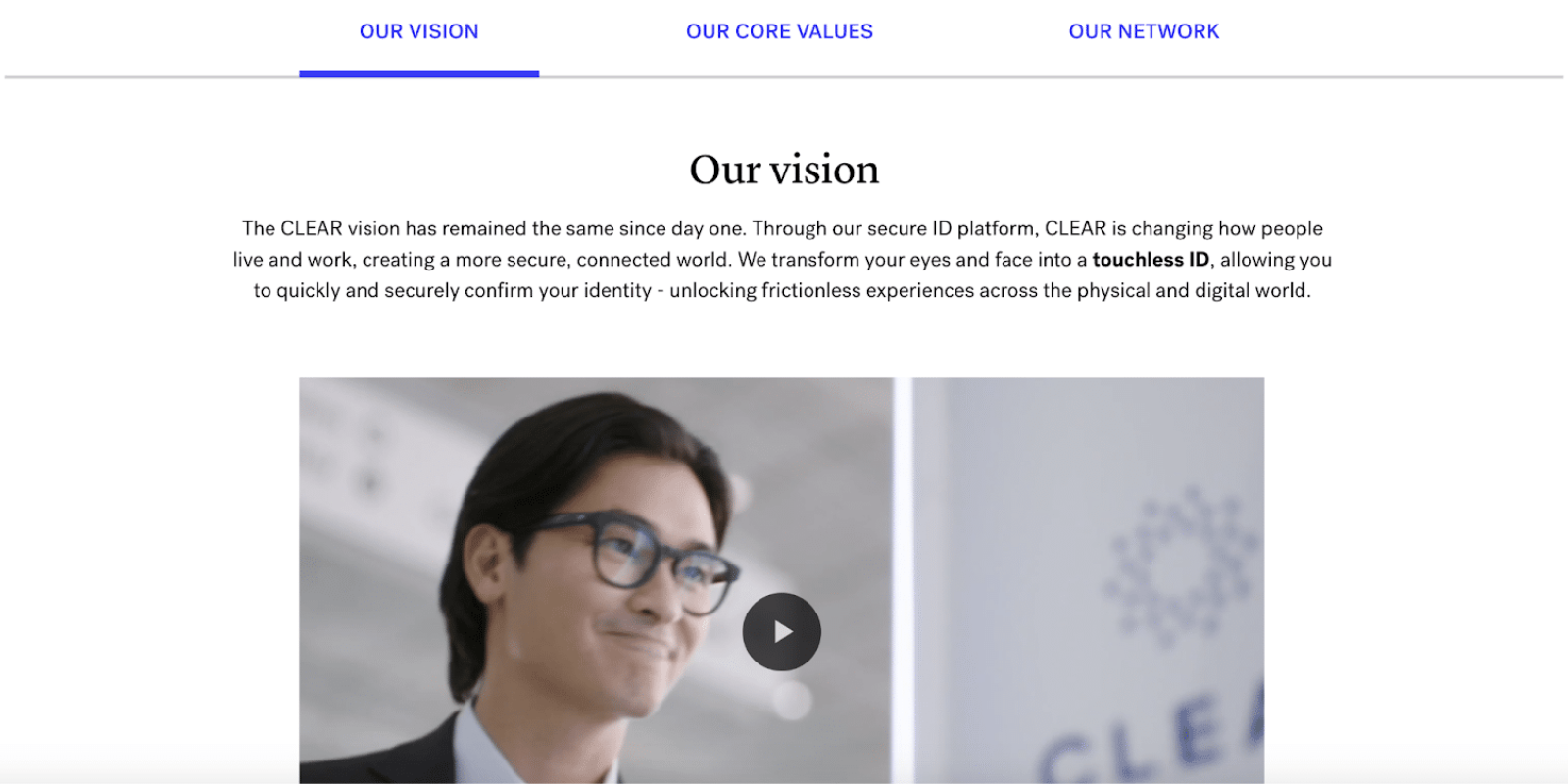
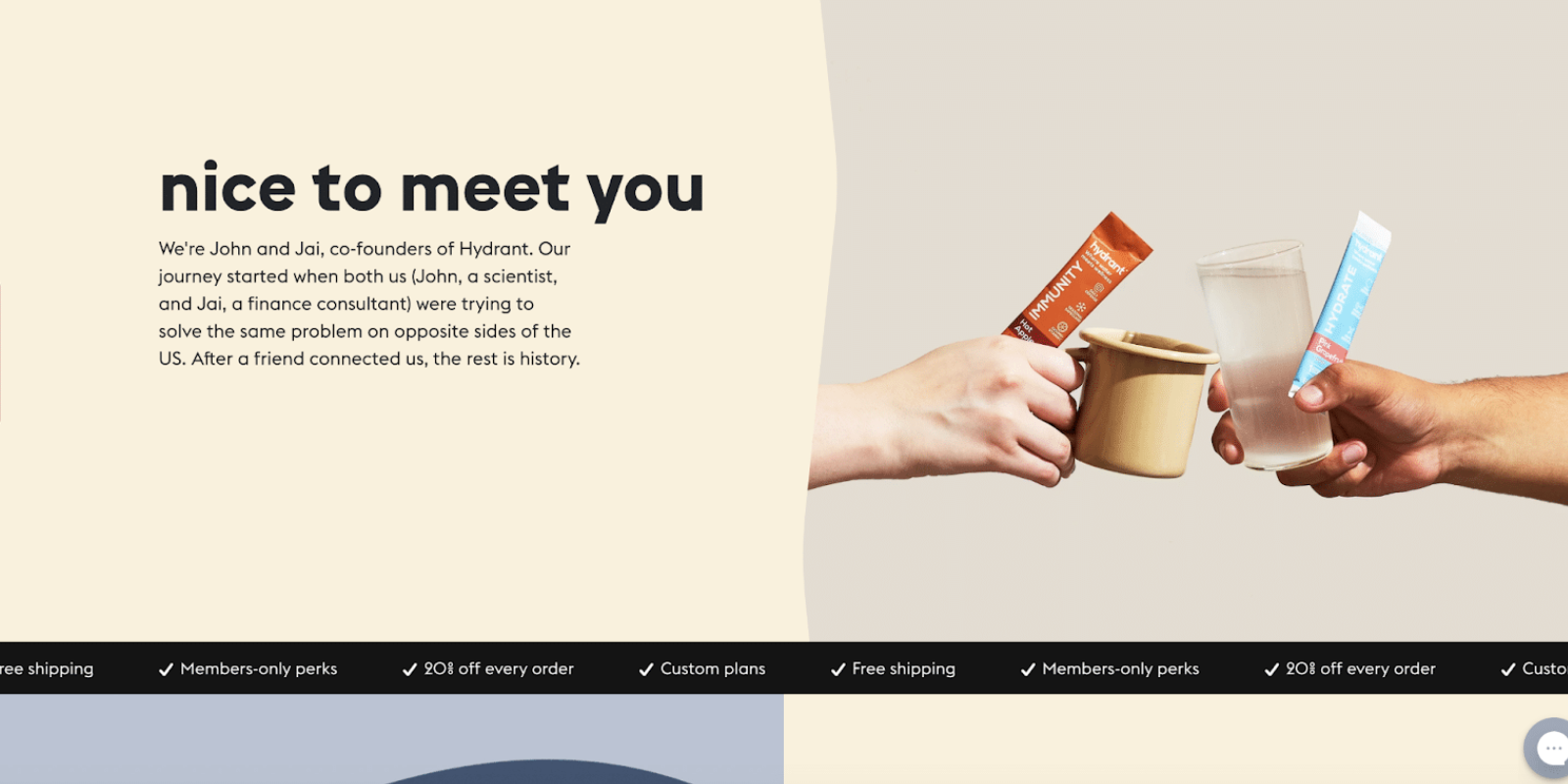
This section should do the following: Reiterate brand/company name, Identify location or locations served, Explain your product/service offering.

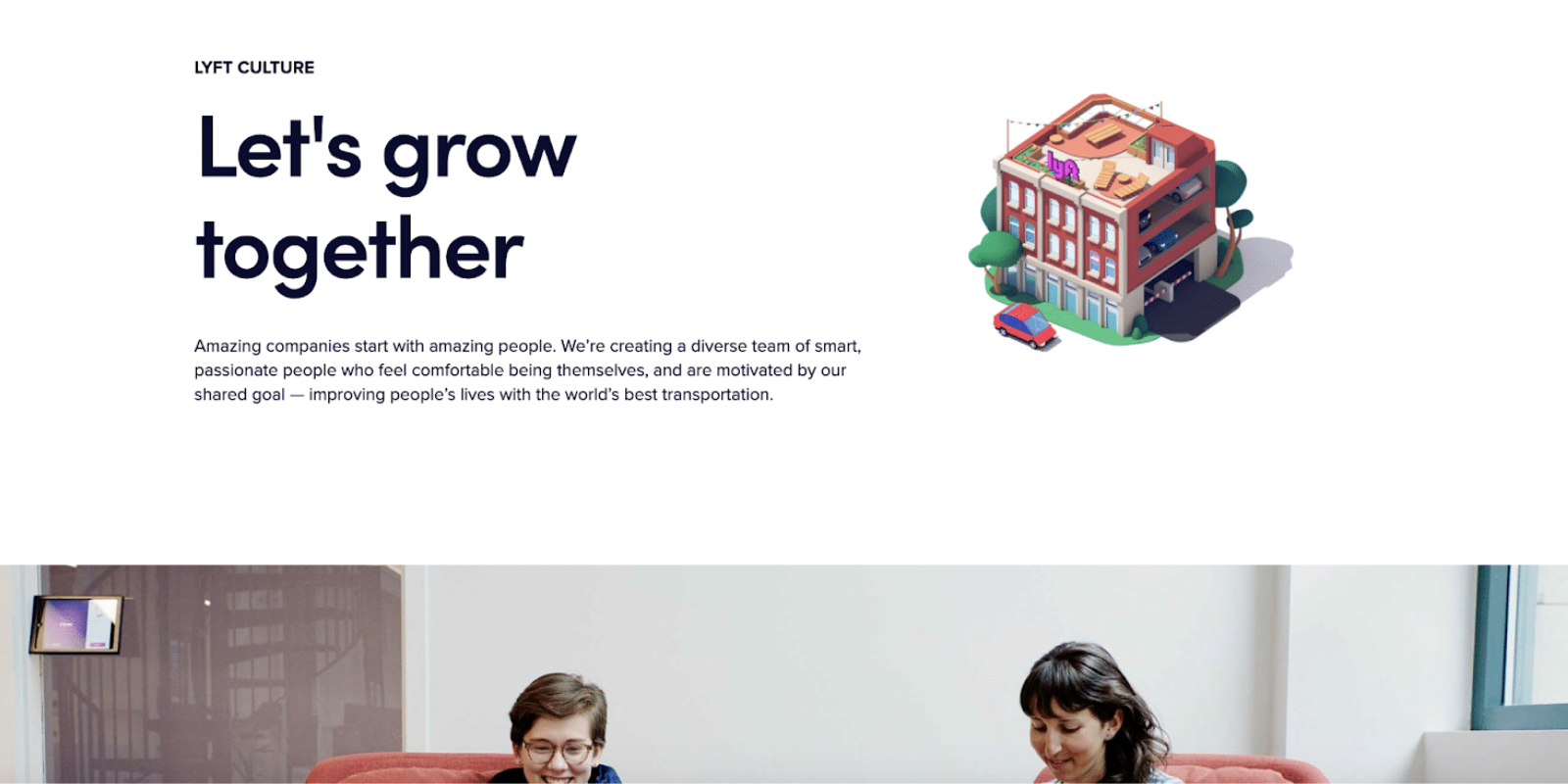
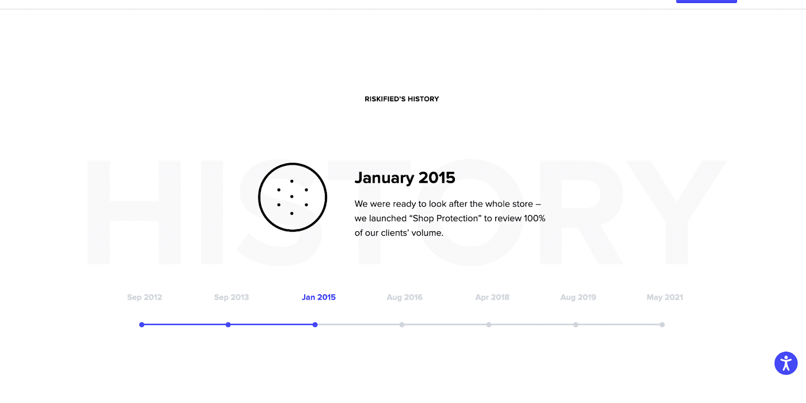
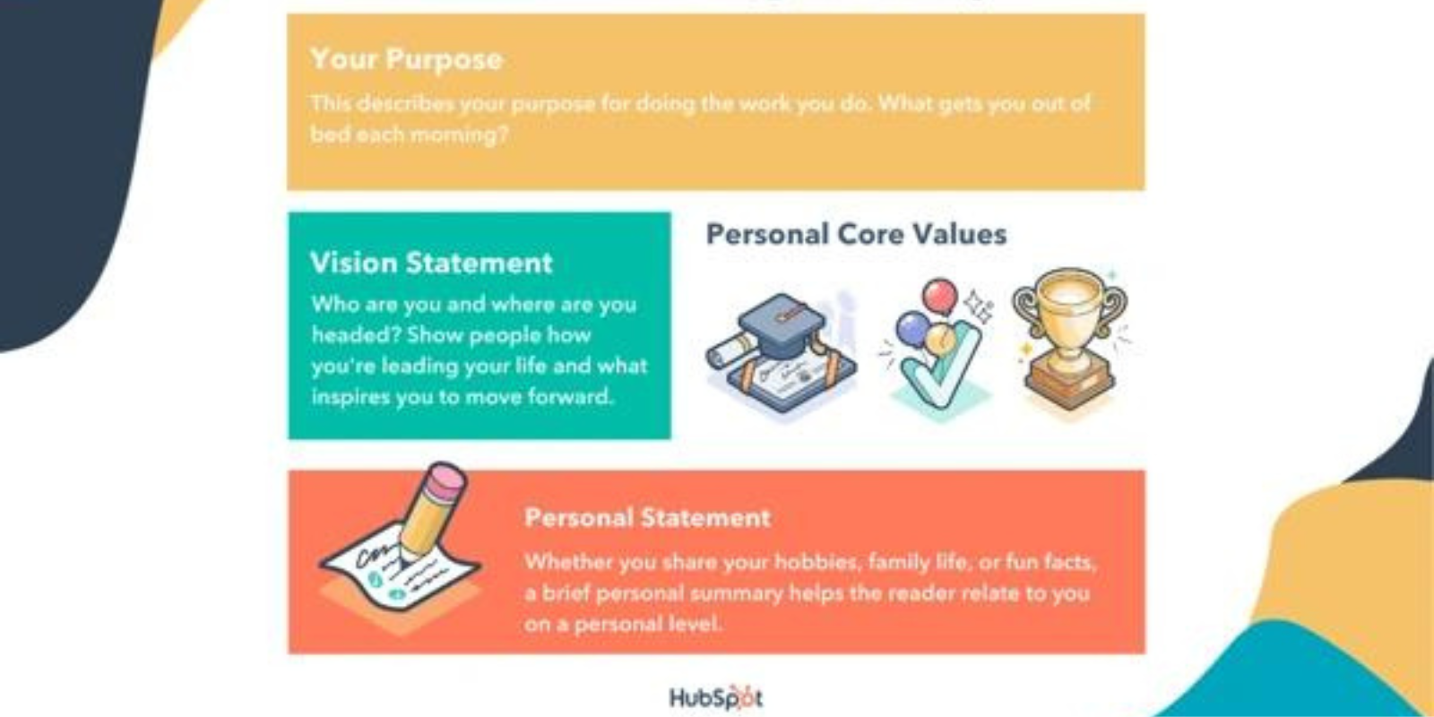
Additional
Thoughts
2 Column: Text/Photo Split
Boxed content organization
Should Inspire
Should Direct User
Services
The
Services Section
OBJECTIVE:
A service section is where potential clients can get a further understanding of the services offered. Usually includes information about the variety of services provided, the process behind it, and its value to customers.
Additional
Thoughts
Leave them wanting more.
Use Clear Images / Icons
Needs clean sectional organization
Make it easy to grasp for the user
USP
The
Unique Selling Propostions
OBJECTIVE:
A unique selling point (USP), also called a unique selling proposition, is what makes your product or service better than competitors. In digital marketing, communicating your USP clearly and efficiently is one of the pillars to allow potential customers to convert on your site.
Additional
Thoughts
Capture what they want to know in the first 10 seconds upon visit.
Make it Useful and Unique
Should Inspire
Must address the value offered and the problem solved.
Testimonials
The
Testimonials Section
OBJECTIVE:
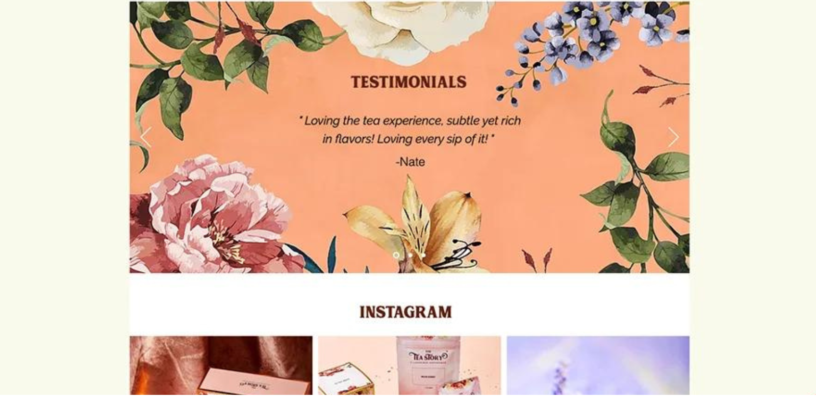
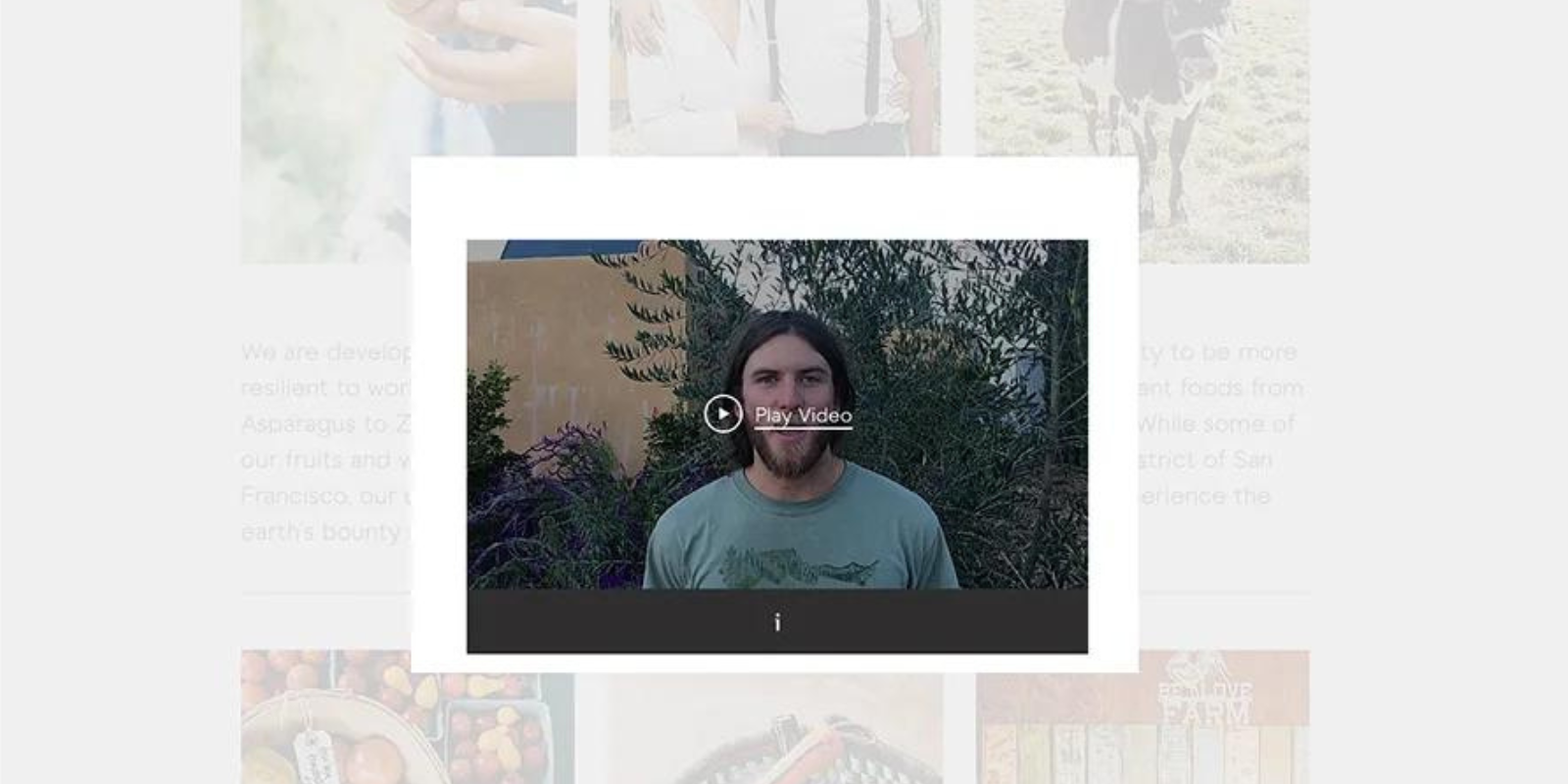
A testimonial is a third-party statement that comments on how good someone or something is. By strategically placing website testimonials on a dedicated ‘Testimonials’ page, as well as on your ‘About Us’ page, product pages, and more, you can convince interested users that you’re worth their trust.
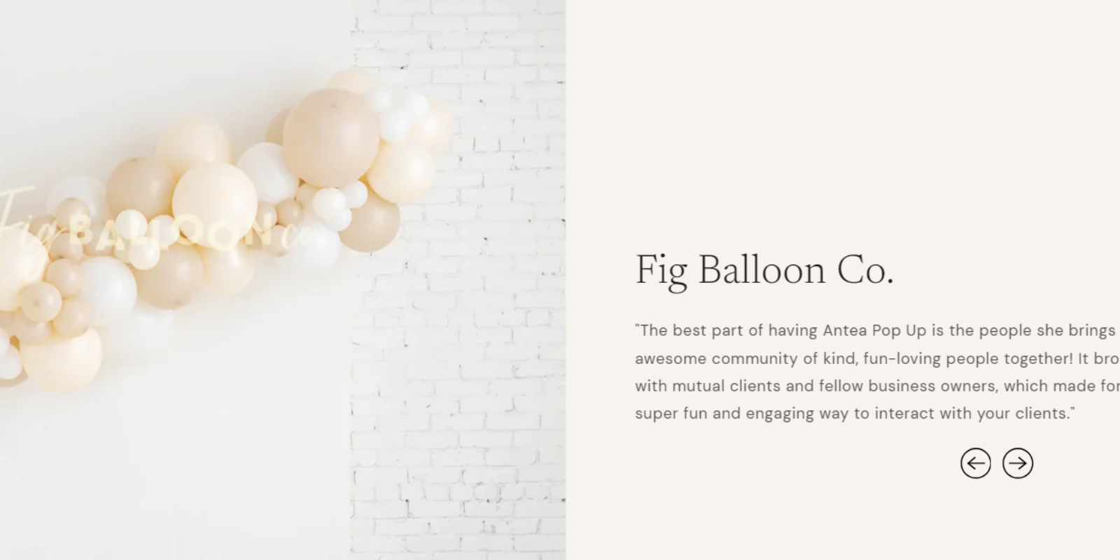
Additional
Thoughts
Place on pages with highest traffic
Video Testimonials are most effective
Alternate formats
Ensure Authenticity
Contact
The
Contact Form
OBJECTIVE:
A contact form is an easy method for your website visitors to contact you. With a form, you can collect contact information, jumpstart lead generation for potential customers, or connect deeper with your website visitors.
Additional
Thoughts
Build Your Marketing List
Populate CRM
Use to Delegate Tasks to Team
Utilize for support tickets
Pop-Ups
The
Pop-Up Form
OBJECTIVE:
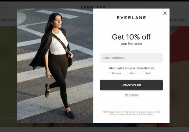
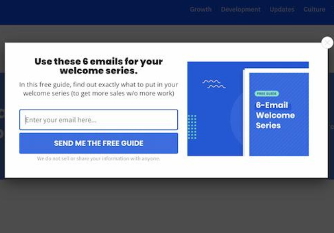
A pop-up (or modal) is a small user interface component that presents in the foreground of a website, typically triggered as a prompt for the user to act on something.
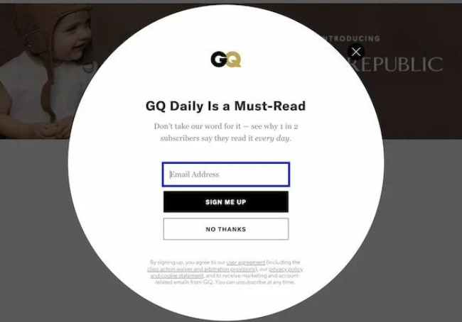
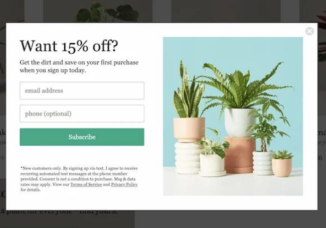
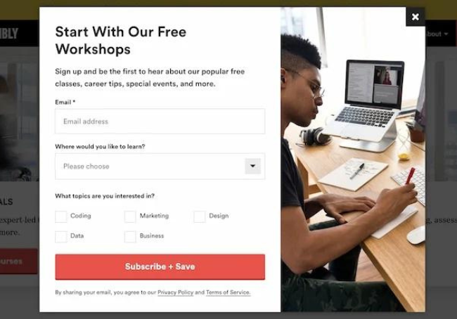
Our
Statistics
Adding Images to Pop-ups can increase the click-through rate by over 25%
Adding opt-out buttons increase the click-through rate by 14.34%
Incentivized pop-ups increase conversion rate
value-first messaging in the pop-up is vital
Pop-ups with an easy mobile user experience increase CTR
Pop-ups with fewer input fields have a higher conversion rate than those with more input fields
Additional
Thoughts
Consider triggers & timing
Keep the user experience friendly
Make the exit process easy
Be extra cognizant of mobile UX
Nav
The
Navigation
OBJECTIVE:
Navigation menus display an organized list of all your web pages from one appointed area. Usually, they present across headers or sidebars, so that they’re clearly visible and accessible for your site's visitors.
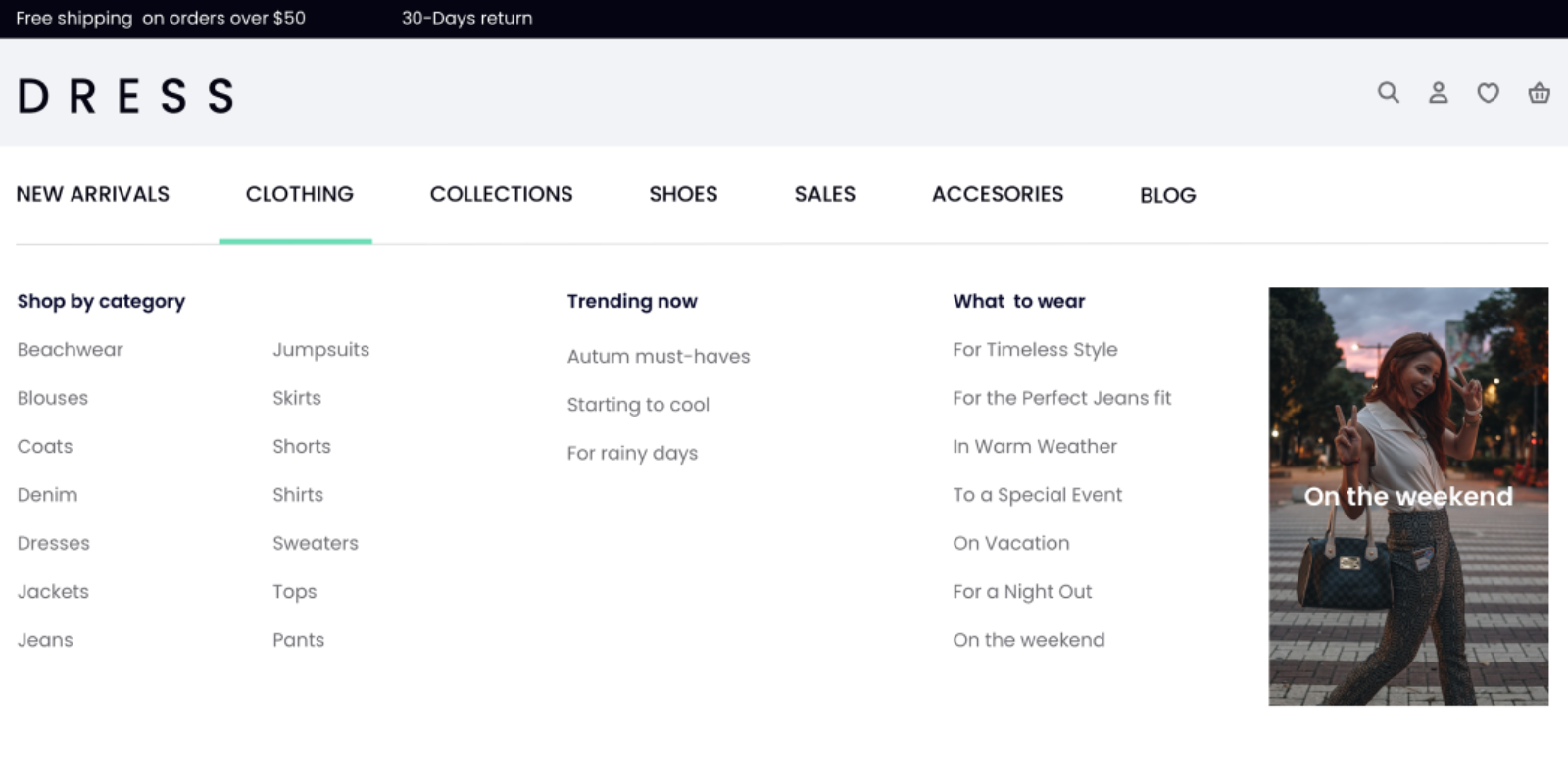
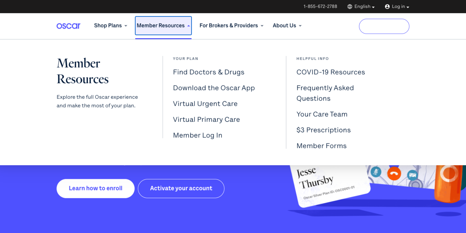
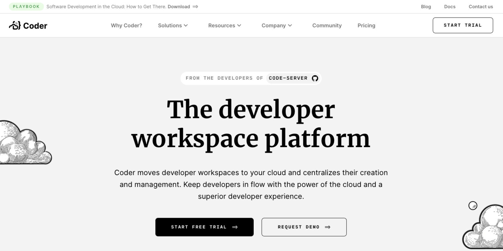
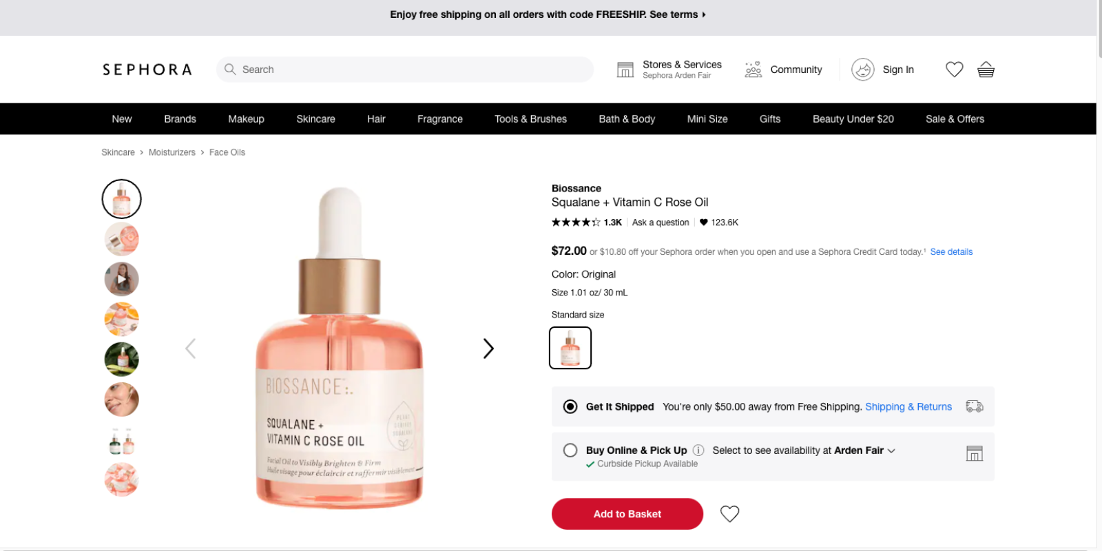
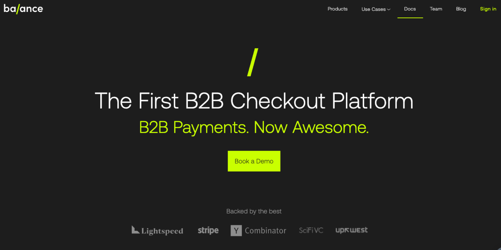
Best
Practices
keep it simple
make it visible
CREATE SEPARATION
ONLY USE BUTTONS AS CTAS
ORDER LINKS BY PRIORITY
OPTIMIZE FOR MOBILE
mega menus
USE DESCRIPTIVE LABELS
Additional
Thoughts
Be Consistent
Pay attention to accessibility
Organize Purposefully
Prioritize Mobile UX
