Is Your Website Responsive?
June 20, 2022 | Anthony Golio
When it comes to building a website, WordPress is a standard that shows up on every “Top 10 Website Builder” list. Whether or not it is the top site builder, 43.2% of all websites on the internet are built on WordPress (W3Techs, 2022), including 36.28% of the top 1 million websites (BuiltWith, 2022). There are many benefits to the WordPress platform, but one of the biggest is the platform’s excess of themes, plugins, premium add-ons, and overall adaptability.
There are several options for page builder add-ons in the WordPress platform, Beaver Builder is one of the leaders. Pairing Beaver Builder with WordPress can be intimidating at first, but this combination opens the doors to endless creative possibilities. With many options, it is important to keep best practices in mind, and responsive layouts are growing more and more important as the rise of mobile web traffic continues to grow.
You’ll find varying metrics on mobile versus desktop traffic. Statista claims 48% of global web traffic is mobile, whereas Perficient estimates mobile to make up 68% of web traffic. Regardless of the exact number, your site will receive traffic via mobile devices. According to Hubspot, 93% of people have left a website because it did not properly display on their device.
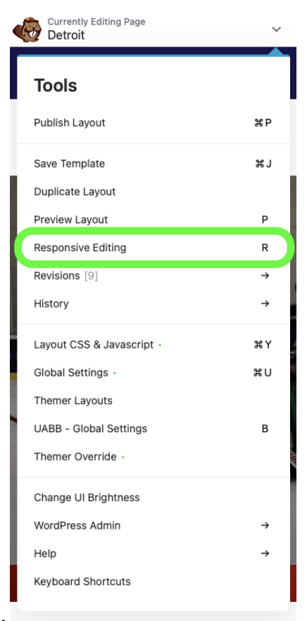
Beaver Builder is an excellent solution to ensuring responsive web pages that will properly display on every device. Responsive editing is a feature that Beaver Builder allows you to make edits that only affect one type of screen dimension. There are a few ways to enter responsive editing mode:
- Go to the menu dropdown and select “Responsive Editing”.
- Use the keystroke by pressing “R” on your keyboard.
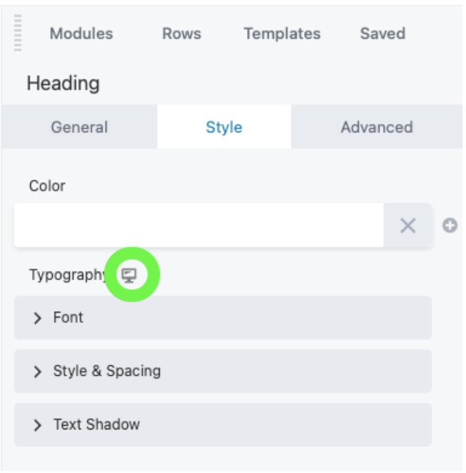
- Within the editing pane, click the device icon to toggle to a new view.


Once you enter responsive mode, take time to focus on proper font sizing, margins, padding, and other edits to ensure the page displays correctly. Once done editing, it is important to preview the layout on all displays before publishing, by selecting “Preview Layout” in the menu dropdown or using the keystroke “P”.
Another feature that can help you level up your mobile presentation is Visibility settings. In the editing pane for rows, columns, and modules there are three visibility settings which include breakpoint, stacking order (columns only), and display. Breakpoint allows you to determine which devices an object displays on. Stacking order allows you to change the order of columns in a row as displayed on a mobile device. The display feature provides multiple options for whether the object shows or not.
Whether it is your home, landing, or checkout page, ensuring your WordPress site is optimized to be responsive to your clientele’s devices is critical. Site traffic that can easily navigate on all device types will result in more conversions and lower bounce rates.
Contact our IOI team today on how to maximize your web page!
